
|
Do you love figures, calculations and graphs? Or would you rather avoid numbers if at all possible? If you’re an editor or proofreader who routinely works on mathematics or science material, you’ll be used to dealing with figures, percentages, tables and graphs. But even editors who work on other texts (academic, business, and even fiction) will sometimes need to handle numbers and data. Perhaps you’re editing a survey report, a paper containing the results of a research study, or an organisation’s annual report. Even if the client isn’t expecting you to perform an in-depth analysis of their calculations and data presentation (and you feel it’s out of your area of expertise – or your comfort zone), there are some straightforward things you can look out for to help your author keep their data in line. Most of what follows is based on my own experience, so it isn’t intended to be an exhaustive list of issues. But I hope it will reassure you that checking figures and data presentation doesn’t necessarily require you to have a PhD in mathematics. Your basic editing and proofreading skills – together with a bit of logic and common sense – can often help you to spot when something’s amiss. 1. Words or figures in the text?This issue will be familiar to most editors and proofreaders. When writing a number, should it be ‘five’ or ‘5’, for example? What about ‘twenty’ or ‘20’? ‘Three hundred and forty-nine’ or ‘349’? This will often be covered in your client’s style guide. A common convention is for numbers below 10 to be written as words, and 10 and above to be written as figures. But this can vary, so it’s worth checking. In some (though not all) conventions, numbers within the same sentence should be made consistent:
In formal writing, it’s preferable to avoid starting a sentence with a figure. This might simply mean using words instead:
Alternatively – and particularly if the number is a large one, or it isn’t a whole number – it’s better to reword the sentence.
If you’re editing fiction, conventions might be slightly different. For example, numbers are often expressed in words when they appear in dialogue. 2. Talking about numbers in the text There are various ways in which statistics can be unintentionally misreported in the text. As an example, let’s look at two statements.
It’s easy to see how the confusion arises: the sentences contain the same words – just in a slightly different order. In some cases – like this one – it’s obvious that one of these sentences is incorrect, purely on the basis of general knowledge. In other cases, such inaccuracies are more difficult to spot without checking elsewhere in the document. Other things to look out for in the text include:
3. Consistency and common sense In the same way that you’d proofread names, punctuation and capitalisation of words and phrases, you should be on the lookout for obvious errors and inconsistencies in numerical content. For example, when numbers are mentioned in more than one place (in a table, in the text, in the introduction, on a graph), are they consistent? Are the correct signs used (+, −)? Similarly, in the same way that you’d use your own knowledge to spot errors when proofreading a general piece of text, you can sometimes see clearly that a mistake has been made. If an author claims that the population of London is 8,787 or 8.7 billion, you’ll probably realise that there’s something wrong. In a school report I was proofreading, I noticed that a student was congratulated on achieving 1.25 cm in the high jump, which conjured up an amusing – though misleading – image. 4. A note about averagesRemember when Michael Gove, the then UK Secretary of State for Education, stated that he wanted all schools to be performing above the national average? Think about it. If all schools are above the national average, that is no longer the average. As proofreaders and editors, we need to have some level of understanding of basic mathematical terminology – or at least, of words and concepts that are in everyday use – so that we can at least raise a query if something doesn’t look right. 5. Problems with percentages An awareness of what percentages mean can help you to spot errors and problems. Even if you’re not going to be checking an author’s calculations, it does help to know that 50% is half of something, 33% around a third, and so on. So if an author claims that 24 of the 47 people in a survey are men, and that this proportion is 25% (i.e. a quarter), it’s something you need to query. As well as basic calculation mistakes, it’s worth being on the lookout for inaccurate descriptions of percentages. I’ve seen ‘majority’ used to mean ‘the largest proportion’. Here’s an example:
This does not mean that ‘the majority of people are employed’ – ‘majority’ means ‘most’ (i.e. more than 50%), rather than simply the largest group. Another thing to check is whether the percentages add up to 100. But beware – that might not always be appropriate. For example, if reporting on answers to a survey question where people could tick more than one option, the total could well be more than 100%. In this example, it’s clear that some people like both apples and bananas:
In cases like this, the percentages won’t necessarily add up to 100. A more subtle issue when it comes to percentage is whether the author really does mean ‘per cent’ (%), or whether they mean ‘percentage points’. As an example, if the unemployment rate in 2001 was 5% and the unemployment rate in 2011 was 10%, the correct way to describe this would be to say that the 2011 rate is 5 percentage points higher than the 2001 rate. The unemployment rate is definitely not 5% higher (in fact, it is 100% higher!). 6. Calculation check Even if the client isn’t expecting you to check all the calculations – some of which might be pretty complicated – there’s no reason you shouldn’t check straightforward sums. Adding up a column of numbers in a table can sometimes reveal some surprising errors, or issues that at least need to be queried. It can be handy to use Excel to check figures: simply cut and paste your column(s) of numbers into a blank spreadsheet and use the SUM function (∑ from the ribbon on the Home or Formulas tab). You can also use Excel to perform other straightforward calculations (%, −, ×, ÷). Even if you don’t routinely use Excel, it’s worth familiarising yourself with the basic functions and with how to create a simple formula. Of course, you can always check figures using pen and paper or a calculator, but Excel can save you quite a bit of time (and – if used with care – can reduce the risk that you’ll make errors in your own calculations). 7. Equations If mathematics isn’t your thing, it’s possible that your eyes glaze over when you see any type of equation. But even if you’re not expected to proofread equations in the text, you can use your existing skills to spot obvious errors. For example, you might notice a term in the equation that’s different from those mentioned in the text. There might be a reason for this, but it could be a typo, so it’s worth a query to the author. Look out, too, for equations that the author has copied and pasted (to save retyping) with the intention of putting in different figures or other terms. Has the author remembered to update all the details? 8. Number ranges I occasionally come across a table or chart in which the number ranges look something like this:
This is a problem because the ranges don’t have clear upper and lower limits: they overlap. For example, in which category would a value of ‘20’ be placed? Only the originator of the data would know the answer, so there’s usually very little that the editor or proofreader can do to correct this, other than query it. Ideally, ranges should look like this:
Or like this:
And if the data includes values that are not whole numbers (e.g. 2.8, 19.99, etc.), the ranges will need to be more exact:
9. Units, decimal separators and thousands separators Again, consistency is the key here, as well as sticking to the style requirements. a) Units
b) Decimal separators In UK and US English, a full stop (full point) is usually used to separate whole numbers from decimals. The decimal point is usually on the baseline of the text, but sometimes a middle dot is used (e.g. 34·12). And in some countries a comma is used as a decimal separator. I’ve come across this most often in work by European authors, but the convention is also followed elsewhere. c) Thousands separators Similarly, there are different conventions for separating groups of digits in larger numbers. In many cases a comma is used (10,000), but some styles call for a non-breaking space (10 000). 10. Checking charts Whole books have been written about the best way to present data in graphs, charts and diagrams, and the mistakes that can be made in data visualisation. Here, I’m just going to highlight some of the issues that I’ve come across when editing material containing such features. a) A suitable style Does the chart present the data clearly and unambiguously? For example, pie charts are often not a good way of presenting data, as this article explains. When checking a chart, graph or diagram, you need to ask whether it makes sense. Can you think of a clearer or better way of presenting the data? b) Gimmicks It’s tempting to use colours and special effects to make a chart, graph or diagram more eye-catching and ‘interesting’. However, that’s often not necessary (unless such effects are part of house style or branding). Bear in mind that colours, shapes and fancy shading can be distracting and confusing for the reader. In any case, such effects will often be stripped out at the next stage of the publication process. c) Axes As a rule, these should always start at zero. In this example, the chart on the right seems to be suggesting that The Times newspaper has twice as many sales as the Daily Telegraph, but that’s simply because the vertical axis starts at 420,000 rather than at zero. Results can easily be distorted if the chart isn’t showing the full picture. d) When charts go wrong Special mention must be made of this chart, which shows the average female height in various countries. It’s misleading in a couple of important ways:
11. Tables You first need to consider whether the table is suitable for the type of document (e.g. an academic paper vs. a brochure aimed at the general public) and whether it presents the data clearly. When it comes to checking the details within a table, the advice I’ve already mentioned is relevant. Use your proofreading skills to check whether figures are consistent with those mentioned in the text. Add up columns to check totals. Apply your common sense to make sure the data looks correct. It’s also worth checking the following specific points: a) Units Are the units clearly stated? For a table displaying only one type of data (e.g. percentages or monetary values), the units are sometimes included in the table caption: Table 1: Owner-occupiers as a proportion of the population, 1950–2017 (%) If the table shows different types of information, the units might be included with each value. So the columns will look something like this: 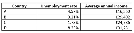 Consider whether the table would be less cluttered if the units were added to the column headers and deleted from the data itself, as in this example: 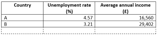 b) Order of information Check whether items are listed in a consistent way. For example, in the table above, the ‘countries’ are shown in alphabetical order. But the author could also have chosen to list them in ascending or descending order, by either the unemployment rate or the average income. Either of these alternatives would have been acceptable. However, if items are listed in apparently random or inconsistent order (e.g. in a series of tables), this might be confusing to the reader. c) Row and column headings Do these clearly explain the data in the table? If there’s more than one table with a similar layout, are the row and column headings presented in a consistent way? d) Table layout I recently came across a table similar to this one (I’ve only included part of the table, although the rest of it was similarly misleading). The author had tried to present information about the sample population, but the table was laid out in such a way that it implied an association between different variables. For example, it appeared that all the male participants are in the three younger age groups, and that all the female participants are in the older age groups. 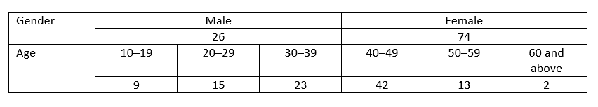 The way this table is laid out suggests connections between the different categories that don’t (in this case) exist. And – to illustrate a point made earlier – you might have noticed that the figures in the ‘Age’ categories add up to 104, rather than 100 (the total for the ‘Gender’ categories). Rather than presenting the information in this way, it would have been better to keep all the categories separate. This is the layout that I suggested to the author. 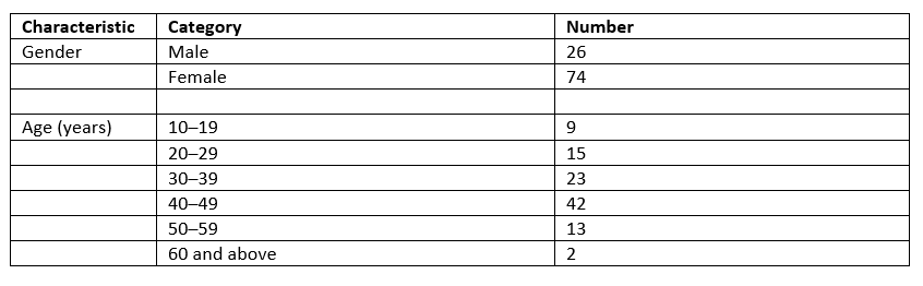 This version is not as concise as the original, but at least it doesn’t suggest relationships that aren’t (necessarily) there. I hope this article has reassured you that your usual proofreading skills, together with a bit of common sense, will help you to check numerical information in a document, even if you don’t consider yourself a ‘numbers’ person. Here’s a summary of my top tips for approaching this type of work.

8 Comments
The life-changing magic of public speaking (and how that’s relevant to editing and proofreading)20/7/2018 For many editors and proofreaders, the natural reaction to the words ‘public speaking’ can be summed up as follows: ‘Aaaaaaaaaargghhhh!’ (Or is that just me?) Editing and proofreading tend to be rather solitary pursuits conducted behind closed doors, away from the public eye. For many freelancers, the need to speak in public doesn’t crop up regularly. In fact, sometimes there’s little need to speak at all in the course of a working day, especially now that online methods of communication are so widely used. And if a public speaking opportunity does occasionally present itself – the invitation to give a talk or deliver a session at a conference – there’s usually the option for the freelancer to say ‘no’ without jeopardising their core editing and proofreading business. So what on earth would possess a freelance editor to step outside their comfort zone and train in public speaking? At a recent meeting of our local Society for Editors and Proofreaders (SfEP) group, we heard from neuroscience editor Julia Slone-Murphy about ‘The life-changing magic of public speaking’. Julia described situations in the past when she had been obliged to speak in public: the sleepless nights beforehand, the sweaty palms, the racing heartrate, the typewritten script delivered rapidly and without looking at the audience… She recently decided to tackle her fear by taking some training. Stepping several miles outside her comfort zone, Julia signed for up both a stand-up comedy course and some training with the Public Speaking Academy. Here’s a summary of what she gained, followed by three top tips for public speaking.  Key benefits of public speaking training
Three Top Tips 1.Make it personal Your audience will be much more engaged in your speech if you remember to be yourself. Remember that we all have something different to say, and a unique way of saying it. Weave your own personal experiences and views into the message you’re conveying. Your audience is more likely to relate to your ‘story’, and your speech is more likely to be memorable and entertaining. 2.Focus on the message Rather than worrying about being the centre of attention during your speech, focus on delivering a message your audience will find interesting. That will move the spotlight away from you and onto your audience: it will help you to give a useful, generous and helpful talk, without worrying about what people are thinking about you. 3.Keep practising You need to find opportunities to carry on honing your skills and developing your techniques, otherwise you’ll be back to square one. Signing up for regular training is a good idea, as is saying ‘yes’ to as many speaking opportunities as possible! Julia has gained so much from the training that she encourages everyone to improve their public speaking skills, whether or not they’re planning to give a presentation or make a speech. Goodbye, sweaty palms and racing heartrate; hello, logical thinking, eloquent delivery and sparkling social and business encounters! Microsoft Word is the standard software used for editing, and Track Changes is one of its most useful features: it shows amendments that have been made to a Word document and allows other people to accept or reject these changes. When I’m editing for a client – whether that’s an academic author, a government body, a business, an organisation, or an individual – my focus is on making it easy for them to see the amendments I have made to their material. Track Changes is the ideal way to do that. I can also add queries or explanations using the Comments function.
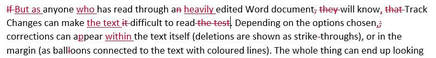
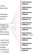
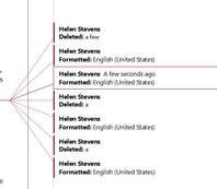 Track Changes: Language changes Track Changes: Language changes There are a few things an editor can do to make it easier for a client to read a document when Track Changes have been used. First, it’s worth considering whether every change needs to be tracked. For example, will the author need to know that you’ve changed the proofing language? If you select all the text and change the language with Track Changes on, this will add a ‘Formatted: [language]’ mark-up every time you make any sort of correction to the text from then on (see left). So you may decide to make this a ‘silent’ change – one that’s made with Track Changes turned off. Another correction that can usually be left untracked is changing double spaces (between words or sentences) to single spaces. The same goes for any unnecessary spaces that occur at the end of a line or paragraph, or within the cells of a table. Changes to the overall formatting – the font size, the line spacing, the paragraph style – are often best left untracked. If it’s important for the author to know that you’ve made any of these untracked changes, you can add a Comment at the start of the document or mention it in the covering email when you return the work. When it comes to sending the edited document back to the client, there are various steps you can take to help with readability and clarity. I usually send two versions of the document:
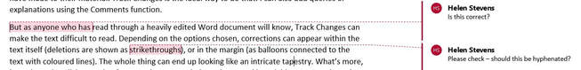 Track Changes: Final view If the client wants to look at all my amendments – apart from the ones I’ve made ‘silently’ – the Tracked document gives them the full picture. The client can go through the document line by line and accept or reject each change at the touch of a button. The points raised in the Comments can also be considered along the way. Alternatively, if the client prefers to read the end result and is not overly concerned with each amendment, the Final version is available. The document can be read without the distraction of coloured lines and corrections, and the Comments are still visible, so any queries or explanations are there for the client to see. Rather than peruse the Final version, the client could, of course, simply use the Tracked version and choose to view the document with ‘No Markup’ (one of the viewing options on the Tracking section of the Review tab). This would look the same as the Final version and would enable the client to quickly view, accept or reject the corrections by toggling from ‘No Markup’ to ‘Full Markup’. 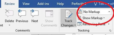 Track Changes: Adjusting the view But I’ve found that clients appreciate having the two different versions – one with changes showing and one with changes accepted – with the Comments visible on both. Track Changes is a useful feature, but there are so many options for how the mark-up appears (and which types of correction are visible) that it pays to keep things straightforward.  Love it or hate it, Microsoft Word is difficult to avoid if you’re an editor, proofreader or writer. So it’s worth getting to grips with Word and familiarising yourself with its many features. This can save you time (which often means ‘save you money’), improve your accuracy, and – particularly when it comes to dealing with repetitive tasks and corrections – leave you free to focus on things that can’t be automated. Even if you’ve been using Word for a while, you may not be familiar with all the tools I’ll mention. Don’t worry: you can still do a good job without them, but it’s worth exploring how each of them could help you. Each tool has its pros and cons, so do take the time to practise and get to know which tool works best for which task. Then, the next time you have a suitable job to do, you can dive straight in and put these tools to work! 1. Find & ReplaceThis is useful when you want to replace one item – whether that’s a single character, a group of characters, a word, a phrase, or most other things – with another. You can refine your search using the ‘More’ button in the Find & Replace box. This will give you various options, such as ‘Match case’ and ‘Whole words only’, and various other choices under ‘Format’ and ‘Special’. 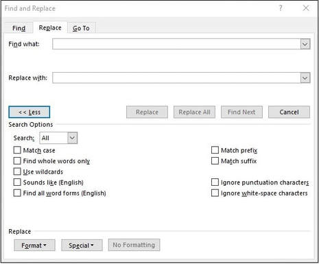 PROS Find & Replace is fairly straightforward and intuitive. It allows you to click through and change items one by one, or ‘Replace all’ if you are sure you need to correct all instances in the document. CONS Beware of unintended consequences, particularly when using ‘Replace all’. The results can be amusing (e.g. changing ‘pants’ to ‘trousers’ results in ‘particitrousers’), but remember that mistakes take time to fix. EXAMPLES Changing one spelling to another (e.g. ‘favor’ to ‘favour’) Removing unwanted spaces (e.g. change two spaces to one space after a full stop) Italicise all instances of a word (using ‘Format’) FIND OUT MORE MS Office support, or Word’s in-built ‘Help’ function 2. WildcardsThis feature of Find & Replace allows you to search for a pattern of characters (rather than a particular character, word or phrase) and make specific changes to it. For example, if you wanted to remove the full stop after Dr., Mr. and Mrs., you could use wildcards to find and replace each of these salutations with one that doesn’t include a full stop – something that wouldn’t be possible with a single Find & Replace action. You need to choose the ‘Use wildcards’ option in the Find & Replace box and then use sets of symbols to define what you’re looking for. For example, [A-Z] will find any upper case letter, while b?t will find bat, bet, bit, bot and but – and, in fact, b5t, since the ‘?’ represents any character. 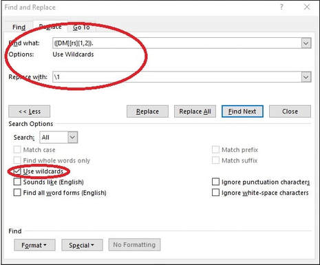 PROS Wildcards are a very powerful tool. They are useful because they allow you to find patterns rather than exact strings of characters (as you do with the basic ‘Find & Replace’). CONS They can seem rather baffling at first glance! It takes time to develop the skill of defining terms correctly, so be prepared to practise. As with a normal Find & Replace, there can be unintended consequences. EXAMPLES Transposing names, dates, etc. Inserting spaces between numbers and symbols Formatting references FIND OUT MORE PC World article WordMVP article Jack Lyon’s Wildcard Cookbook (free to download from the Intelligent Editing website) 3. PerfectItThis is an add-in for Word that you can purchase from Intelligent Editing. It’s a consistency checker that analyses your whole document, finds inconsistencies, and lists them so that you can choose whether or not to change each one. PerfectIt has a host of other features, including the facility to use wildcards as part of your tests. It has different style sheets that are available to users, and you can customise the tests to check for specific style issues. You can also share your own style sheets with other users. 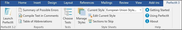 –PROS PerfectIt is easy to install and use, and it is immensely useful, even if you don’t take advantage of all its customisability. You’re always in control, as you decide which corrections to make and which to ignore. PerfectIt can be useful for analysing a document before you begin editing and for checking that you haven’t missed anything once you’ve finished. It’s customisable to your own or your client’s requirements. CONS You have to pay for it! It's available on an annual subscription, and there are hefty discounts for members of various organisations, including the Society for Editors and Proofreaders (SfEP). A previous drawback – that PerfectIt was only available for PC – has recently been partially rectified with the introduction of a cloud version, which can be used on a Mac. EXAMPLES Hyphenation Variant spellings (ise/ize) Capitalisation List punctuation Heading styles Number styles Abbreviations (are they all defined?) FIND OUT MORE Intelligent Editing website 4. MacrosA macro is a series of commands that you run together to save time on repetitive tasks. Each macro performs a different function, or series of functions, and you install each one separately so that you have a menu to choose from. You can also assign keyboard shortcuts to each macro, which speeds things up even more. Anyone can write their own macros, but there are plenty of ready-made ones available. UK editor Paul Beverley has produced a whole book of them, including instructions on how to install and use them, and this is free to download. He also has a useful YouTube channel. 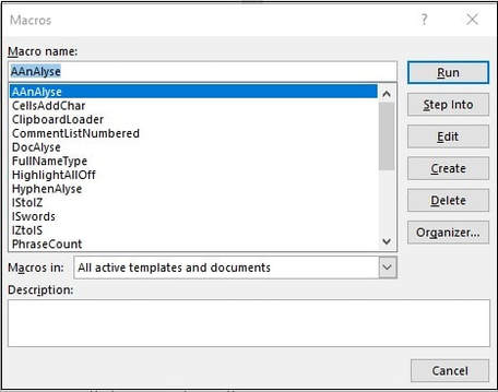 PROS Macros are powerful tools that can save literally hours of time on repetitive tasks. They’re free to write, install and use. Even ready-made macros can be customised, once you’re familiar with how they’re put together. CONS They may seem daunting at first, but once you’ve installed your first macro, the world is your oyster! Beware of unintended consequences (see above). EXAMPLES A couple of Paul Beverley’s ‘big’ macros:
FIND OUT MORE Paul Beverley’s website Paul’s YouTube channel There are plenty of online resources to help you with these and other features of Microsoft Word. The Society for Editors and Proofreaders (SfEP) has an excellent course – Editing with Word – that covers these and many other aspects of the software. Do spend some time getting to grips with these tools and exploring what Word can do. They can help you to achieve greater accuracy, consistency and speed in your editing and writing. What’s not to like?  |